Tableau dashboards for 2Market
As part of my Data Analytics career accelerator course with LSE I developed a set of Tableau dashboards using data from 2Market, a fictional supermarket. The goal was to illustrate customer demographics (focussing on age and number of children), show sales by product type and market and show which social media platforms were most effective for advertising.
Click here to see the dashboards on Tableau public
I enjoyed learning to use Tableau and I think it provides some nice visualisations and features. The experience is a little smoother than Power BI although at a higher cost.
The visualisations
I have included a few screenshots but the dashboards are best viewed on Tableau Public as this allows the interactive filters to be used.
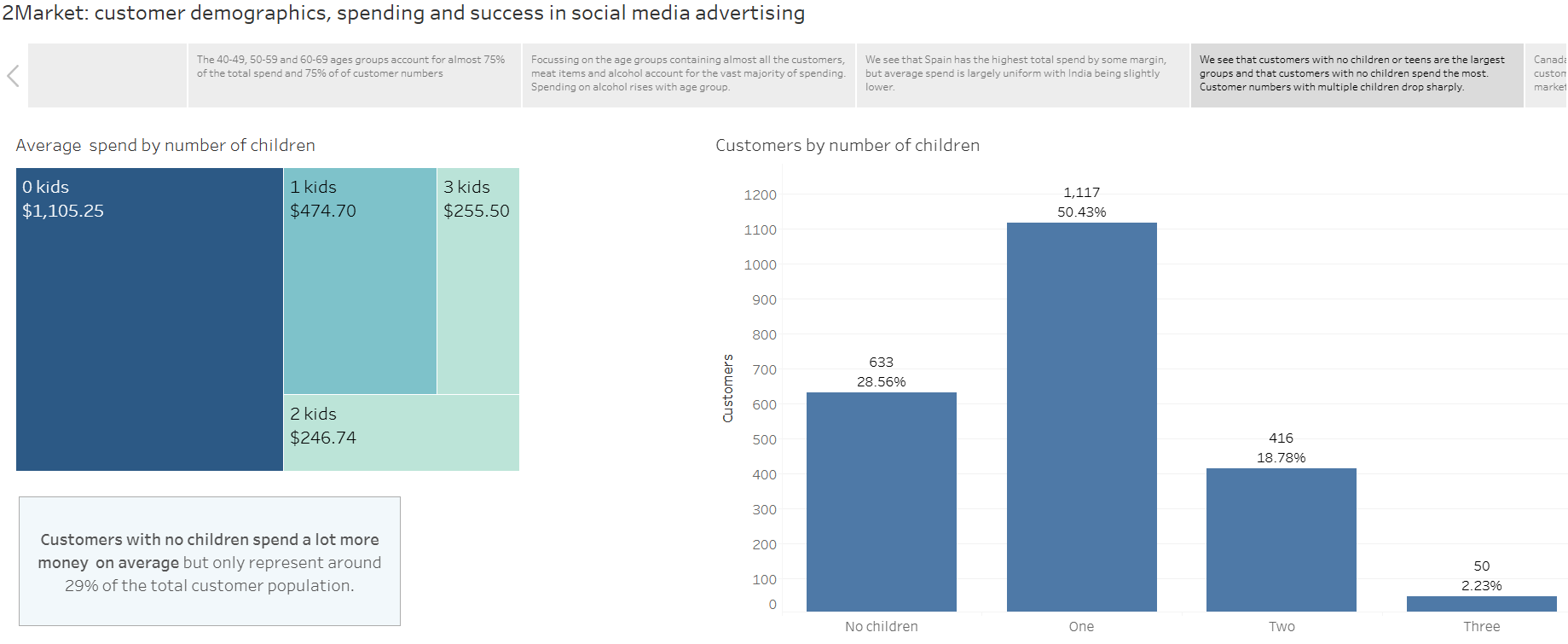
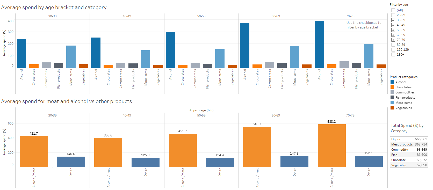
I focussed on using the best type of visualisations for each task. For instance to show average spending across a range of product types, I see no issue with using a bar chart. They are simple and widely understood. I have added interactive filters to allow the user in this case to select the age groups they wish to compare.
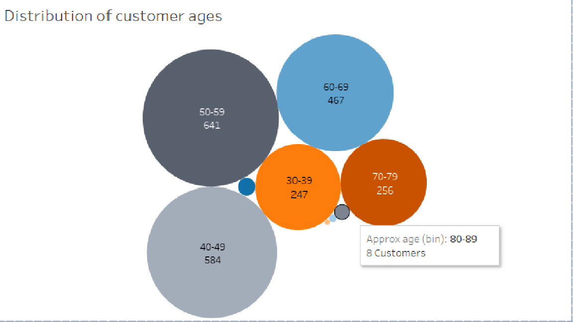
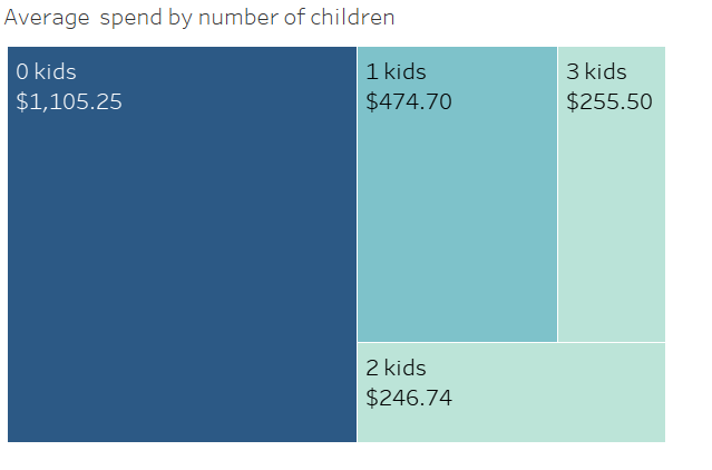
In other cases, I have used for example bubble charts and treemaps which provide a similar function but provided a little variation within my assignment presentation. There is a tradeoff with the bubble charts as some groups have such small bubbles Tableau does not display the labels. However I added tooltips so that the labels are shown on mouseover.