
NHS data analysis using Python
During my LSE data analytics course, I used Python (Pandas and Numpy libraries) to import, wrangle and analyse data. Matplotlib and Seaborn were used to produce visualisations.
On my second project, I analysed real NHS appointment data to determine whether there was sufficient capacity in the network to meet the demand for GP appointments.
Data cleaning
The 3 source csv files provided were imported into dataframes and checked for duplicates and null values using isna() and isnull(). Boxplots were used to assess outliers. There were some outliers > 1.5 IQR (Interquartile range) but this reflects some service settings having larger numbers of appointments. A rural practice with 2 GP’s will naturally service fewer appointments than a London practice with 12 GP’s. No outliers were removed.
Data exploration
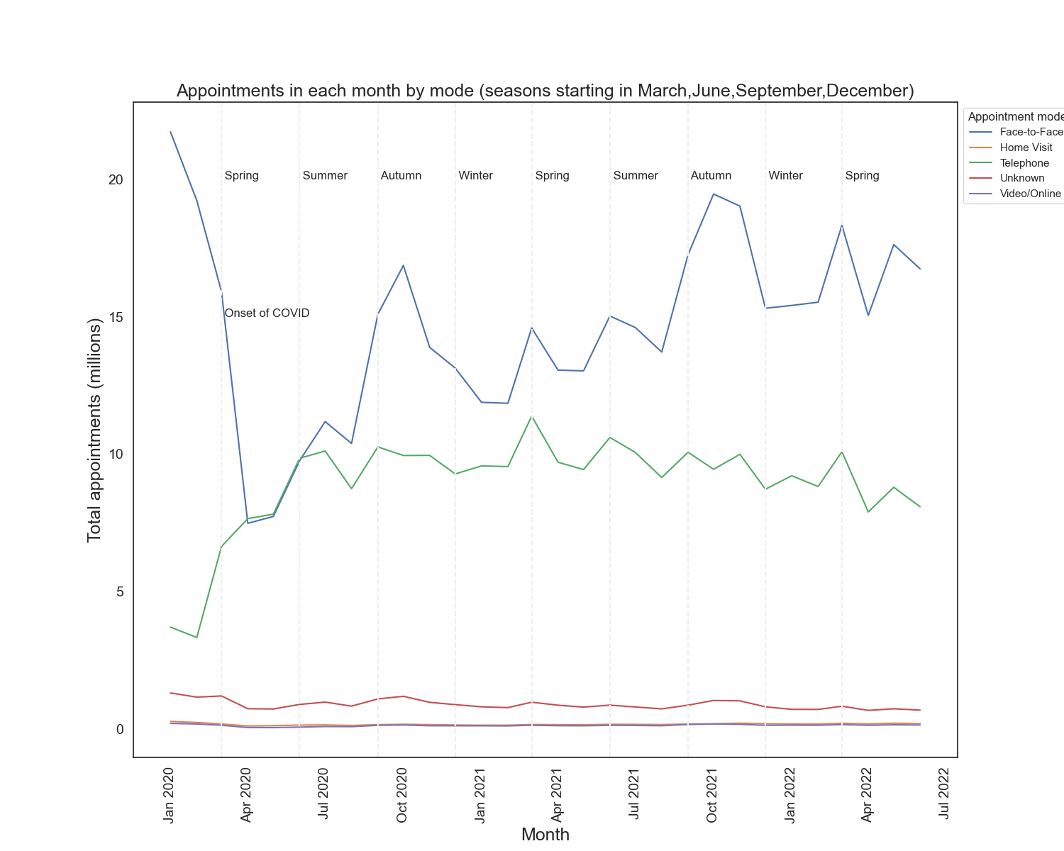
Some of the data was provided only at the monthly level and some at the daily level. Python date functions were used to add a standard appointment date format column to each dataframe representing the 1st of the month of the appointment date. This was to allow monthly appointment analysis. The overlapping period of the 3 files was identified as December 2021 to June 2022 inclusive.
Matplotlib was used to show the change in the number of appointments in each “mode” (face-to face, phone etc) across this period. The data shows a clear peak in demand for face-to-face appointments in late Autumn and Spring each year, likely due to the increase in flu around those periods. It is interesting to note that there was far less seasonality in the demand for phone appointments.
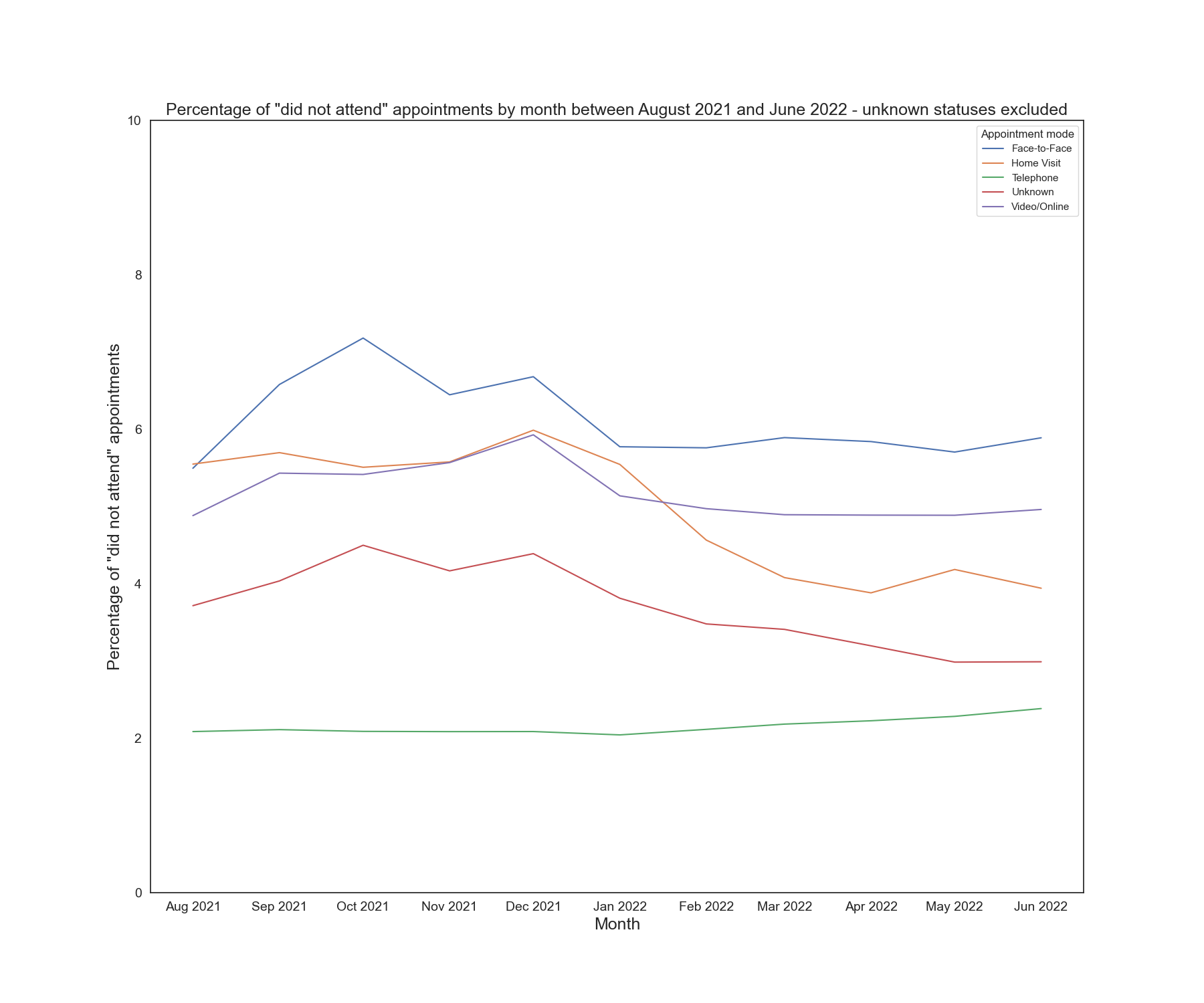
I also used Matplotlib to show the change in the percentage of DNA (did not attended) appointments by month, with a different coloured line for each mode.
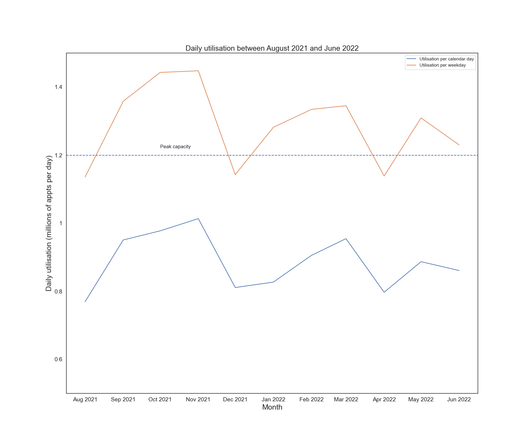
A daily utilisation for each month was derived by taking number of appointments and dividing by the number of business days in the month. This is justified by the fact that less than 1% of appointments take place at weekends. The NHS has a daily maximum capacity of 1.2 million appointments. Matplotlib was used to show the change in daily demand vs capacity for each month.
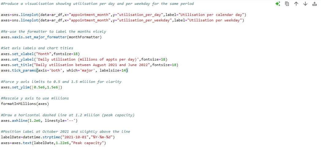
Some of the Python code to plot the utilisation data and format the chart is shown below. The entire Jupyter Notebook is at my GitHub repo here
The project was a good introduction to Python and the powerful libraries available for data analytics. My conclusion was that if capacity was calculated using the number of working days in each month covered by the period in which the three sources overlapped then the maximum capacity was exceeded in most months. Whilst it is perhaps not a great surprise to find that the NHS requires more resources it is instructive to go through the process of producing data-driven insights to prove it.
I am looking forward to the next module covering machine learning.