
COVID Power BI report
I was interested in how Power BI could be used to tell a story about COVID, so I developed some reports using public domain data from Kaggle. The goal is to show the changes in case, death and recovery rates during the early stages of the COVID pandemic.
The report uses mainly bar and line charts with slicers.
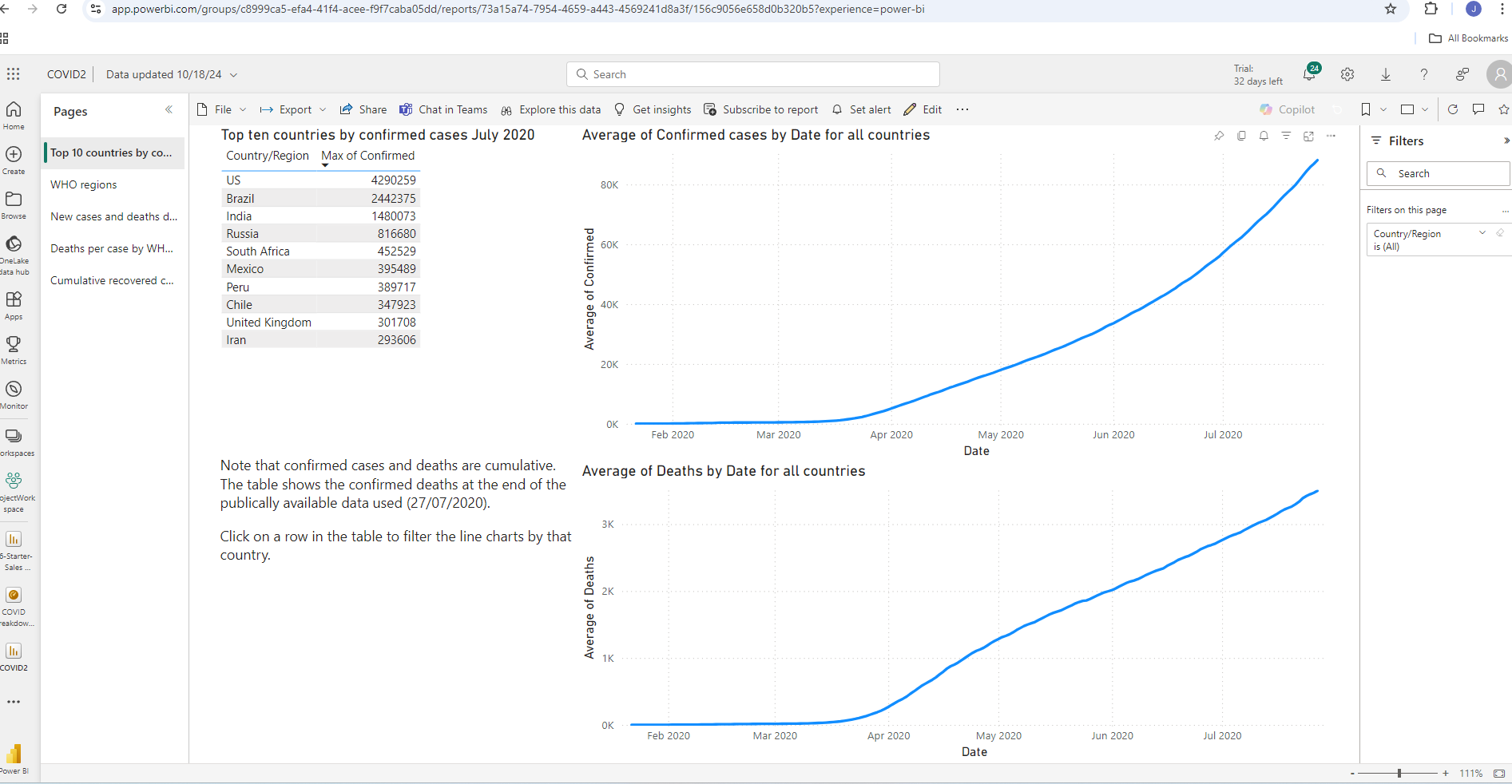
The first page shows a table of the top 10 countries by number of confirmed cases at the end of the reporting period. Clicking a row on the table filters the line charts to data from that country only. The line charts show average confirmed cases and deaths across the reporting period for all countries. As we would expect we see sharp increases from April to June 2020.
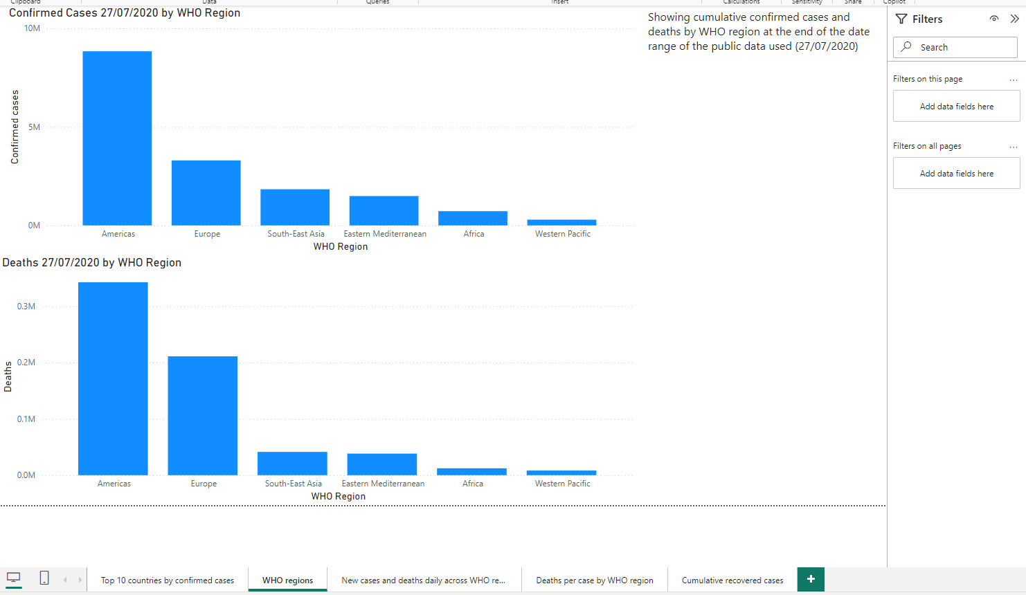
The second page breaks down cumulative confirmed cases and deaths by WHO region at the end of the reporting period. We see a lot more cases in the US but given the populations regions such as Africa, was there some under-reporting?
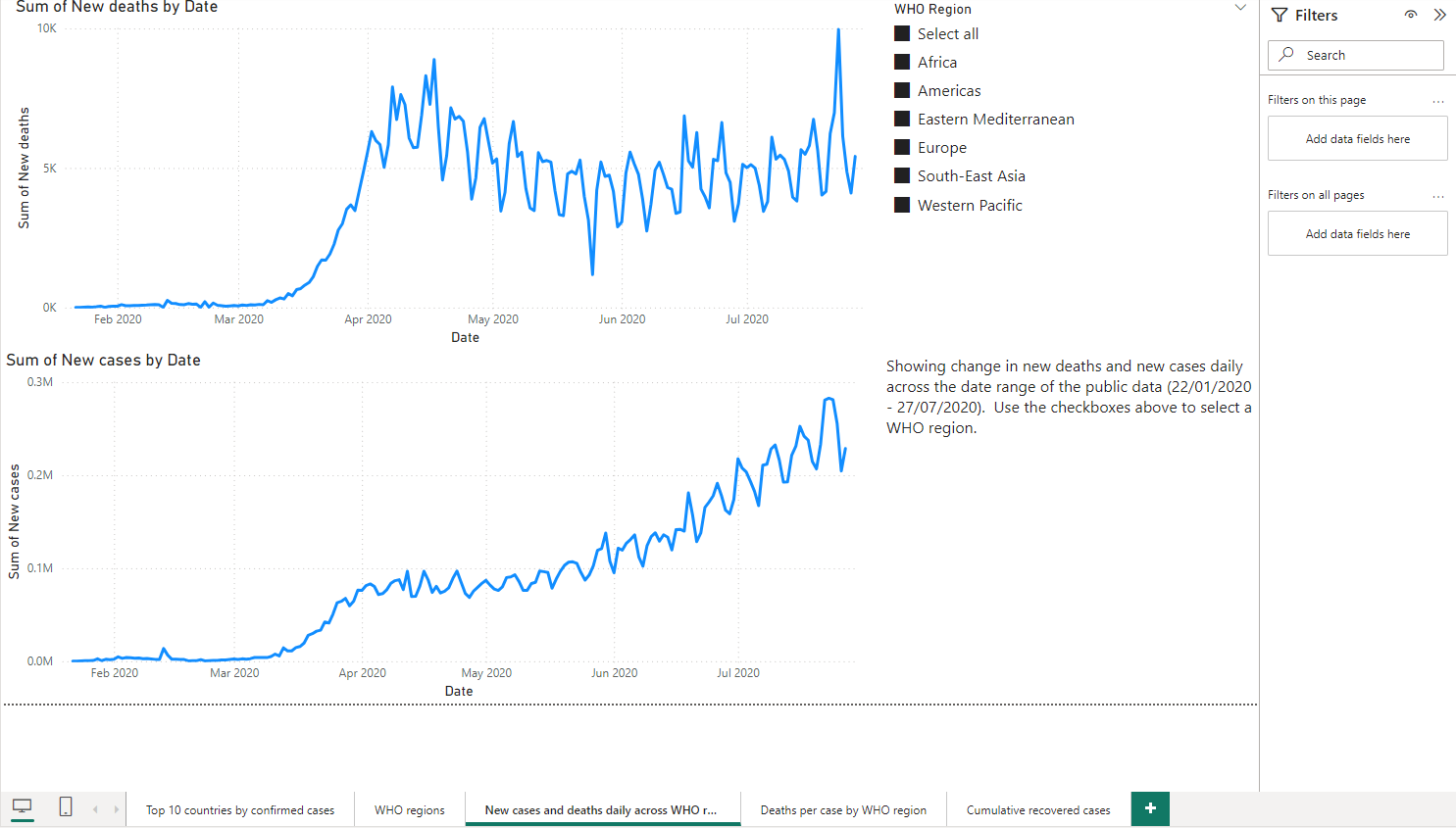
The third page shows the changes in new cases and new deaths across the reporting period using line charts. A slicer allows this to be refined by WHO region, or all regions. We the expected increase in new cases but also an interesting set of secondary peaks and troughs.
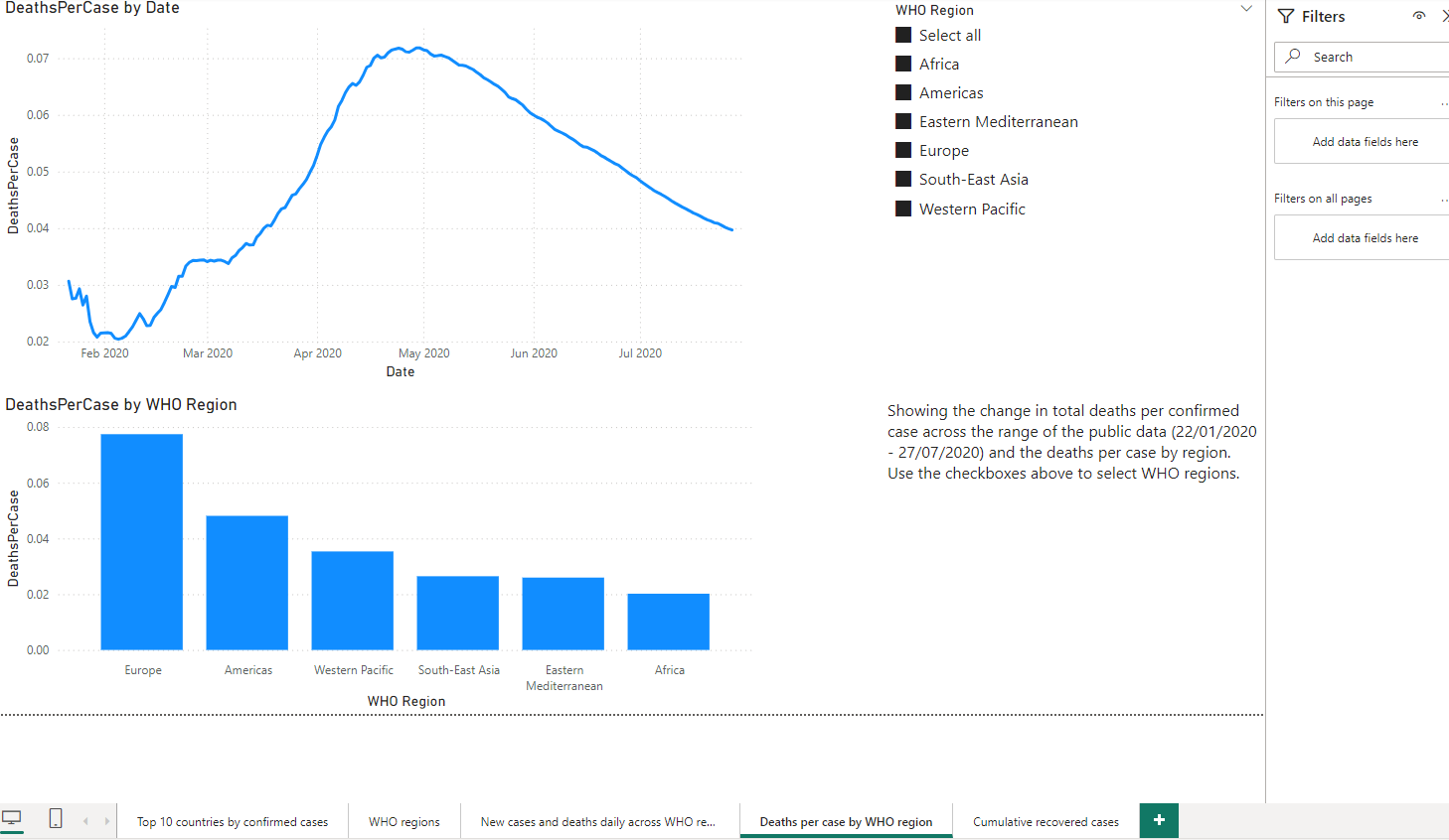
The fourth page shows the change in deaths by case across the reporting period, and also the cumulative deaths per confirmed case for each WHO region. A slicer allows this to be refined by WHO region, or all regions. The slicer is synced to the slicer on the previous page so changing one will filter both pages. This analysis uses a DAX measure to find the cumulative deaths on the final day of the reporting period:
DeathsAtEndOfDateRange = CALCULATE(sum(full_grouped[Deaths]),LASTDATE(full_grouped[Date]))
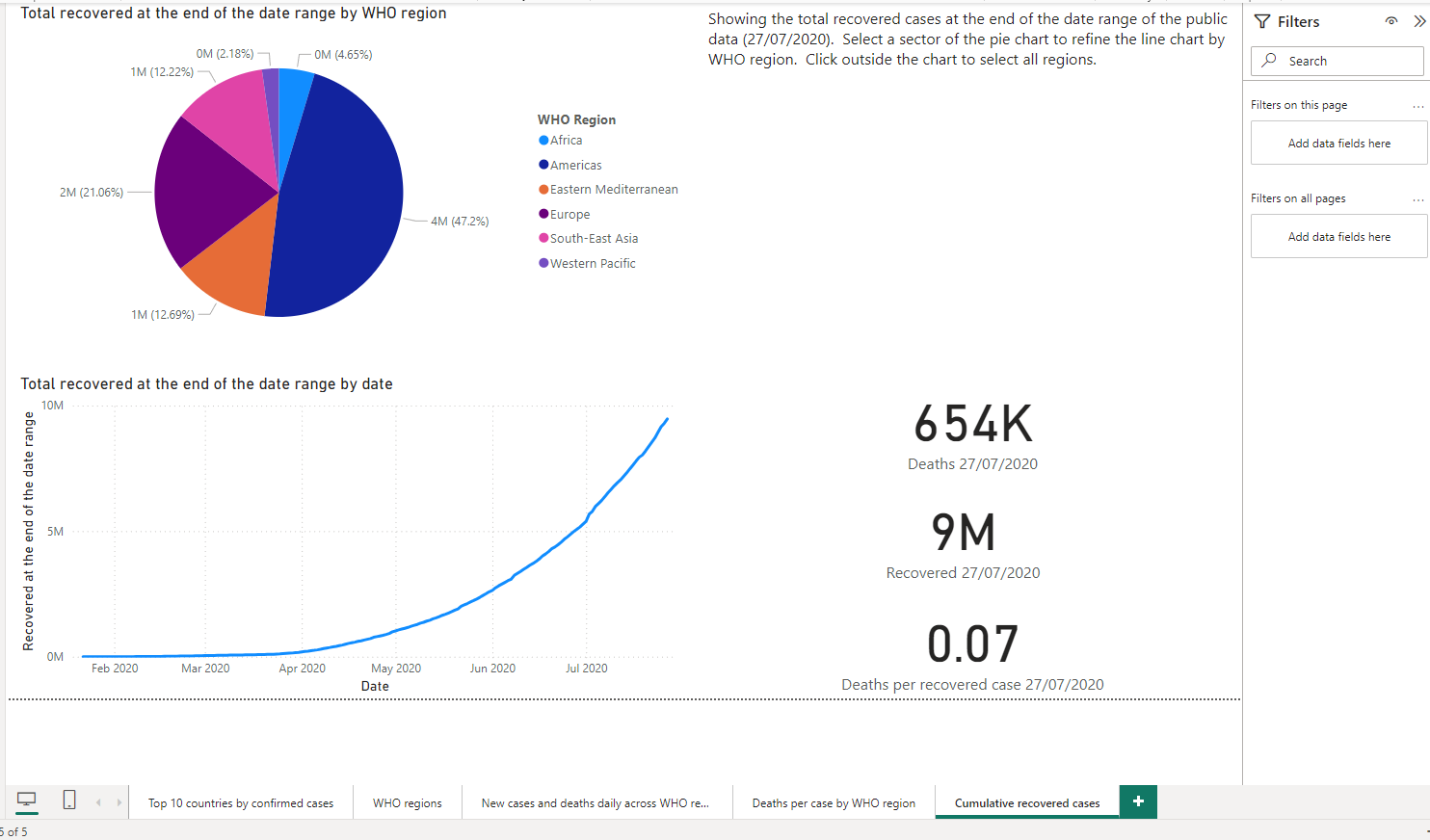
The fifth page shows a pie chart of the total recovered cases by region and a line chart showing the change in total recovered across the reporting period. Selecting a sector of the pie chart will filter the line chart to show the selected region(s) only. A DAX measure was used to find the recovered cases on the final day of the reporting period: CALCULATE(sum(full_grouped[Recovered]),LASTDATE(full_grouped[Date]))
Deficiencies of the analysis
The data only covers Jan - Jul 2020 so does not include the period where vaccines started to take effect. It also appears that WHO regions such as Africa may be underreported as the number of cases is quite a lot lower than other regions such as the Americas.
Conclusions
As expected growth in confirmed cases and deaths increased drastically in early April 2020. New cases oscillates during each week, possibly due to “Monday reporting” factors. Deaths per case increases drastically March-May, then begins to decrease. This may be due to healthcare systems ramping up to better cope with the crisis and the effects of “lockdown” measures. Europe and the Americas have the highest cases and deaths but again this could be affected by underreporting from some countries.